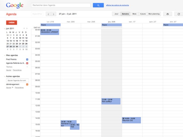
Google seems to want to enjoy the summer to update all the service or launch of new tools (like Google+ , in case you would not have even noticed) and its agenda is no exception to the rule. For indeed,Google Calendar now enjoys a new charter much more refined and much more current than the old. And as usual, if you can not enjoy it at home, you will find in the rest of the article a ton of nice catches all cute.

The first thing that strikes by connecting to the new agenda, the whole upper part of the service that has enjoyed a nice refreshing spring. There are exactly the same as Google Search, namely a long gray horizontal bar that contains the logo of the firm, and a search box that beautiful blue button . Well, if you wanted to nitpick, one could say that it contains the icon (a small magnifying glass) is too low for a couple of pixels but it's frankly not death either. Just below, we can distinguish one second horizontal bar that contains this time a bunch of gray buttons to navigate within the calendar, to alter its presentation (day, week, month, 4 days ...) , print or to recharge.
Below, the page is still divided into two zones. On the left you can find a red button for creating a new event, a representation of our agenda, the different calendars that we created and a part dedicated to the task management. In the same place but a little lower, you can find everything about the shared calendars. Overall, the presentation of this area is the same as the old version and the changes made by the firm are mostly cosmetic. On the right, you can access our course calendar and all appointments. Again, the changes are few but the developers of the firm still have the opportunity to work on their CSS and the result is quite pretty to watch.
Same also for the creation of a new event. The page dedicated to this function also underwent a facelift and the famous saving a little outdated links have been replaced by beautiful red and gray buttons. The whole is rather airy but this page I still considerably less enthusiastic than before. Let's say the charter and the presentation of features on the page could have been a little better arranged.
Oh and if you ever do not take advantage of the new version of Google Calendar at home, remember to empty the browser cache in case ...


0 comments:
Post a Comment